As we all know, the Nasdaq has taken a beating for the past two years after making historic gains. In this article we will
present some comparisons between the recent crash of the Nasdaq with the 1929 crash of the Dow Jones Industrials. There
are some interesting correlations between these crashes, even though they are completely different indexes. We hope that
graphical comparisons may help rationalize when a bottom has been found. This is not a scientific study.
Using
historical data, we constructed a weekly linear chart of the
Great Depression (below). The bear market of the Dow Jones began in the first week of September, 1929. Investors back
then didn't break even until the 3rd week of November, 1954, approx. 1313 weeks later. That bear market lasted 25 years!

We know how painful the current market has been for investors of today, but to put it in perspective, take a moment and
imagine how they felt back then for all those years. People who started investing prior to the Great Depression, would have
had to wait 25 years just to break even. Therefore, many people died poor.
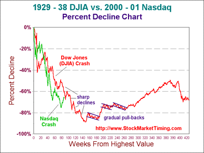
Let's zero-in and analyze the declines of the 1929 crash and the recent Nasdaq crash (chart below). The red line is
the decline of the 1929 crash, and the green line is the Nasdaq bear market that started on March 11th, 2000.

After re-constructing the data into a percent decline chart, and placing the points together when both crashes were at
their highs, some interesting areas can be observed: (1) marked similarity between the 1929 crash and the recent Nasdaq bear
market (sharp spikes followed by sharp deepening declines), (2) current Nasdaq bear market is declining at a faster pace than the 1929 crash,
and (3) potential of the Nasdaq of declining further or length of time when a bottom will be made. No one knows how long the
current Nasdaq crash will last, but we may be able to rationalize when a bottom has been made by observing the nature of
the declines.
When we observe the pull-backs during the crashes, the declines were sharp and deepening with lower bottoms. When
looking at the market bottom (147th week) of the 1929 DJIA crash, the next spike was again sharp as usual, but the following
decline was more gradual. At about the 190th week, the market experienced a favorable retest and the deepening effect was
over since it made a higher bottom. It was then followed by a couple more spikes and gradual declines. This observation may shed some light on the
duration of the current Nasdaq crash. So, let's look at this even closer in the chart below.

Looking at the Nasdaq decline during the 60th through 70th weeks, the slope is rather gradual. But then around the 75th
week, the terrorist events occurred, causing the Nasdaq to plummet. After the most recent spike in the market (80th through
90th weeks), it is pretty certain at this time (November 30, 2001), that we should have some type of pull-back. It will be
interesting to see how this pull-back will occur. Will it be sharp or gradual? If it is gradual and we have a favorable retest of
the Nasdaq lows (meaning a low that is the same level or higher), that may mark the bottom for now. On the other hand, if
the Nasdaq continues to make another sharp decline from here with a deeper low, we may not have found bottom and the
crash continues.
We feel the next few weeks ahead will tell us whether the correction is over or if there is more selling to be done. Either
way, one thing is for certain: the market will not continue to make gains like it has for the past two months.
A worst case scenario is that if the current Nasdaq bear market lasts as long as the 1929 crash, we will not get a
bottom until the first quarter of 2003. And as stated in our previous article,
DJIA Historical Charts,
we believe the future market will be a traders market for the years to come. Forget the buy-and-hold days, they're over.
We hope this information better informs site visitors and members of our philosophy of the stock market.

